In the last few weeks, our small team (that we will introduce to you in more detail very soon) entered the Crimson Company app production phase. During this time, we already implemented an AI that allows you to progress and unlock new cards when no human player is around (try it now in our Android early-access version). You can also play unrated practice games with no waiting times at all versus the AI. With the last couple of updates we iterated on the AI and in its current state it is already quite tricky for new players to beat it. But what's next?
Until the end of the year, we have big plans to further improve the app. First things first, we want to concentrate on the core of the gameplay experience, i.e. what you'll be spending most of your time with in the game. Therefore our plan is to improve the UI shown within a match to make things way clearer, prettier and easier to use.
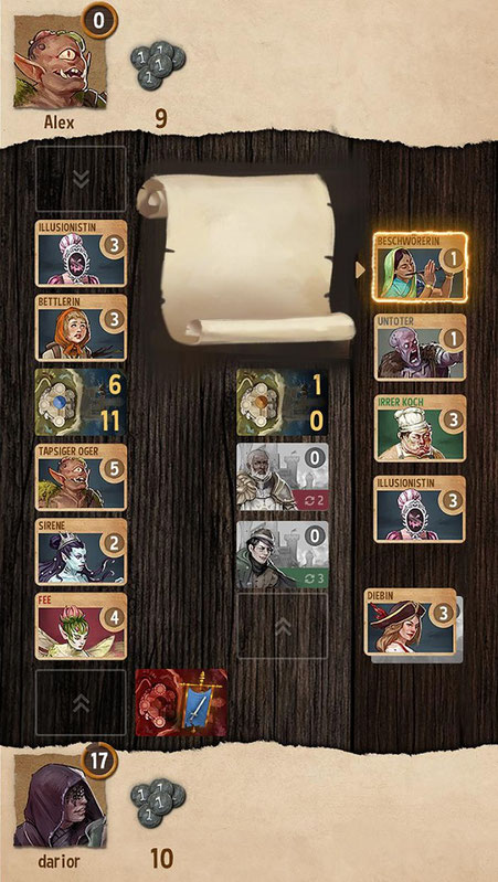
Next up: UI Rework
The goal of the UI rework is to provide players with the best possible overview. In order to achieve that, we're improving several aspects:
- The artwork is zoomed in, centered on the head of each character to allow you to easily identify them at a glance.
- Each card's background color allows your to read in which phase its effect triggers on first sight (income, recruitment, scoring, destruction and so on).
- The strength value is bigger to improve readability on small screens.
- Face-down cards still show the greyed-out character portrait together with an indication of their strength and ability. This way you'll always know what to expect when a card is flipped face-up again.
- One of our favorite things about the new UI is that we show the ability of a card via a scroll when you tap it (you can see it in the design sketch). This makes it possible to learn what a card does without ever losing focus on what's going on in the game.
- We also plan to introduce indicators of where you could place a card in any given situation (shown via a card outline and the two arrows).
- Finally, there will of course be a general design pass in terms of style, contrast and assets. Overall the game should be much more pleasant to look at and easier to read at the same time.
We hope to be able to release the first iteration of the new UI soon for the mobile version - so stay tuned!
Is there anything you particularly like or disagree with? Or any additional features or changes you'd like to see? We are eager to read your feedback in the comments!
Write a comment