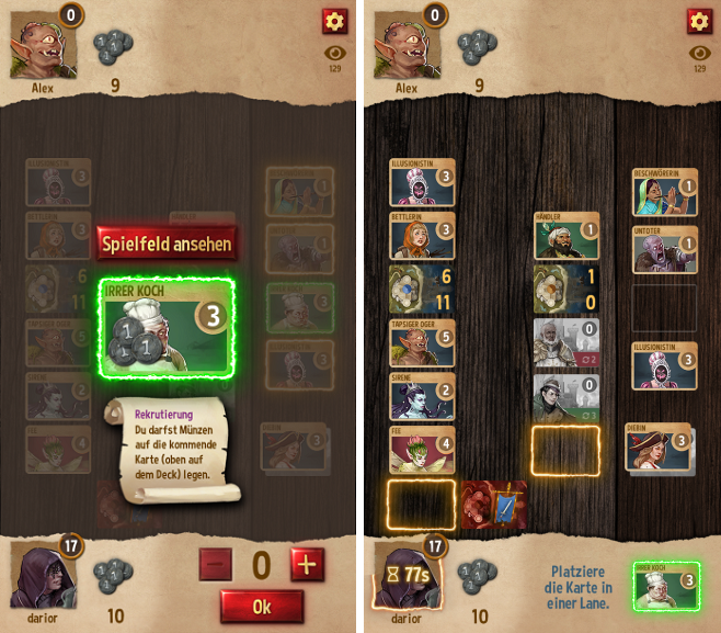
We started working on the details of the new UI and the first things are already being implemented as we're writing this post! As you can see in the images above, there'll be a few more cool feature additions and changes apart from those mentioned in our earlier blog post on the topic:
- There'll be a new big "bidding screen", which will make it very clear which card you (or your opponent) are currently putting coins on. Above the card there'll be a button allowing you to switch to view the full board anytime.
- In the second screen you can see the look of the new highlighted card slots which will make it clear at a glance where you can place a card you're holding (which will by the way still be visible and selectable for more information in your player area at the bottom).
- The huge bars showing your remaining time per turn have turned into a fuse reaching around your player avatar. While the seconds tick down, it will get shorter and shorter and eventually the text display will turn red to make it very clear that you're low on time.
- Also, we have a shiny new button design! :)
Let us know what you think of these additions! We're looking forward to having you test the new UI for yourself very soon in our mobile app and improve it even more afterwards based on your feedback!
Write a comment